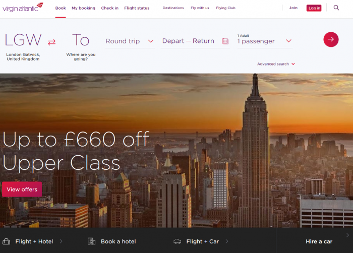
You might have seen a link to the new Virgin website floating around the Web – and if you haven’t, go check it out now.
I’ll wait.

How about that, huh? I bet you weren’t expecting that from an airline website. Let’s chat about why we think this is great.
Here are three things we at Happy Medium have learned from Virgin’s site redesign:
1. Cut the fat
One of the most frustrating things I encounter when visiting a site today (other than it not being mobile-friendly) is the amount of crud you have to wade through before getting to what you were really looking for.
You know when you visit a site, and a modal window pops up asking you to subscribe to an email newsletter or download their mobile app?
That is fat.
You know when you’re visiting a business’s website to find its hours and address, and you have to scroll past a giant photo of their CEO and a novel about their company values before finding it in the footer?
That is fat.
And I’m sure you’ve visited a website on a mobile phone hoping to perform some action (like adding a product to a cart or reading an article), and the target for your action is small and surrounded by “LIKE US ON FACEBOOK” and mountains of unnecessary text.
That is fat.
It’s so refreshing to see a site where the user’s desired actions are priority #1 – not advertising, mobile app promotion, or other junk.
Now, does Virgin have any fat? Maybe.
The “middle chunk” could use some refining, but it does appear after the main action of the site (booking a flight). And I think most web designers have struggled with finding ways to display a bunch of content with equal priority – and this may be one of those situations. Regardless, I’m interested to see how the Virgin America team continues to refine the website.
2. It’s OK to be responsive (and not adaptive or device-dependent)
As more web designers become familiar with building websites for mobile devices, there tends to be a sense of disagreement about whether sites should be 100% responsive or if they should simply adapt to different mobile devices. The adaptive approach is similar to the “m-dot” site approach which has since faded (where mobile sites would exist at a separate domain altogether, like m.pnht.org).
Generally, the argument for adaptive sites has been that you can completely customize an experience for a particular set of devices for scenarios where the site is complex or requires a lot of interaction.
However, adaptive sites fall short in a few ways, and we like to avoid building them:
- They use “browser-sniffing” to serve a different version of a stylesheet.
What happens when Apple releases its newest phone and changes the device identifier, or a whole new line of Android devices come out which doesn’t trigger the stylesheet change? - They can be difficult/confusing to update.
When you’re adding content to an adaptive site, you can be confident with how it looks in your desktop browser, but you don’t really know what it’s going to look like on your phone or tablet (without pulling out those devices, logging in, and hitting refresh every time). With a 100% responsive website, you can simply drag the edges of the browser down to its smallest width to see how your content behaves across different screen sizes.
That’s why I’m so excited to see a site like Virgin go with a 100% responsive approach. I think a gut reaction among a lot of designers and developers when they think of building an airline booking website is, “Oh, we’ll definitely have to build a separate adaptive website or even a mobile app to make this work for our users.”
Virgin threw those concerns out the window and decided that they could build a single website which performs well on any device.
Booking a flight typically involves tedious tasks like picking your destination dates, destination times, and seats. Virgin America combats this by making it easiest as possible for the user: tapping a button. You don’t even see a regular input (like text) until you’re prompted to optionally log in before picking your seats. That saves a lot of confusing keyboard shuffling moments and makes the process seem so much quicker.
Just look at the seat selection view. They made this work on as a website on a phone using the same HTML used on a desktop site!
3. Optimize everything
Try optimizing:
- image sizes,
- stylesheet and Javascript file sizes,
- http/2 connections.
Good web hosting is a must for great speeds. At the scale of Virgin that’s probably something like Amazon AWS or Google Cloud.
On a smaller scale, A2Hosting is a champion.
4. Airline websites don’t have be ugly
Yuck. I’m sure we’ve all seen some ugly, outdated airline websites. But Virgin breaks this tradition by introducing the modern design of their new site.
Would this work for any airline website? Absolutely not. Virgin has a distinct, fun brand – something that just wouldn’t connect with consumers of other airlines.
But since Virgin America is afforded this “fun” image, their design team had fun with a lot of things:
The page listing their destination airports also contains some clever illustrations. Each city has personalized vector art representing the culture:
This has drawn attention from designers and illustrators, too:
And after each step of the process, you get a personalized success message based on your selected destination:
It’s clear that adding personal touch and having an attention to detail can make a large, cumbersome project great for the end user.
What are your thoughts on the America website? Have you used it to book a flight, and have you had any troubles using it? I’m curious to hear your thoughts.